How to Make Table Headers Sticky in WordPress: A Step-by-Step Guide
In this Article, You’ll learn how you can make the Header section of your default wordpress table block sticky.
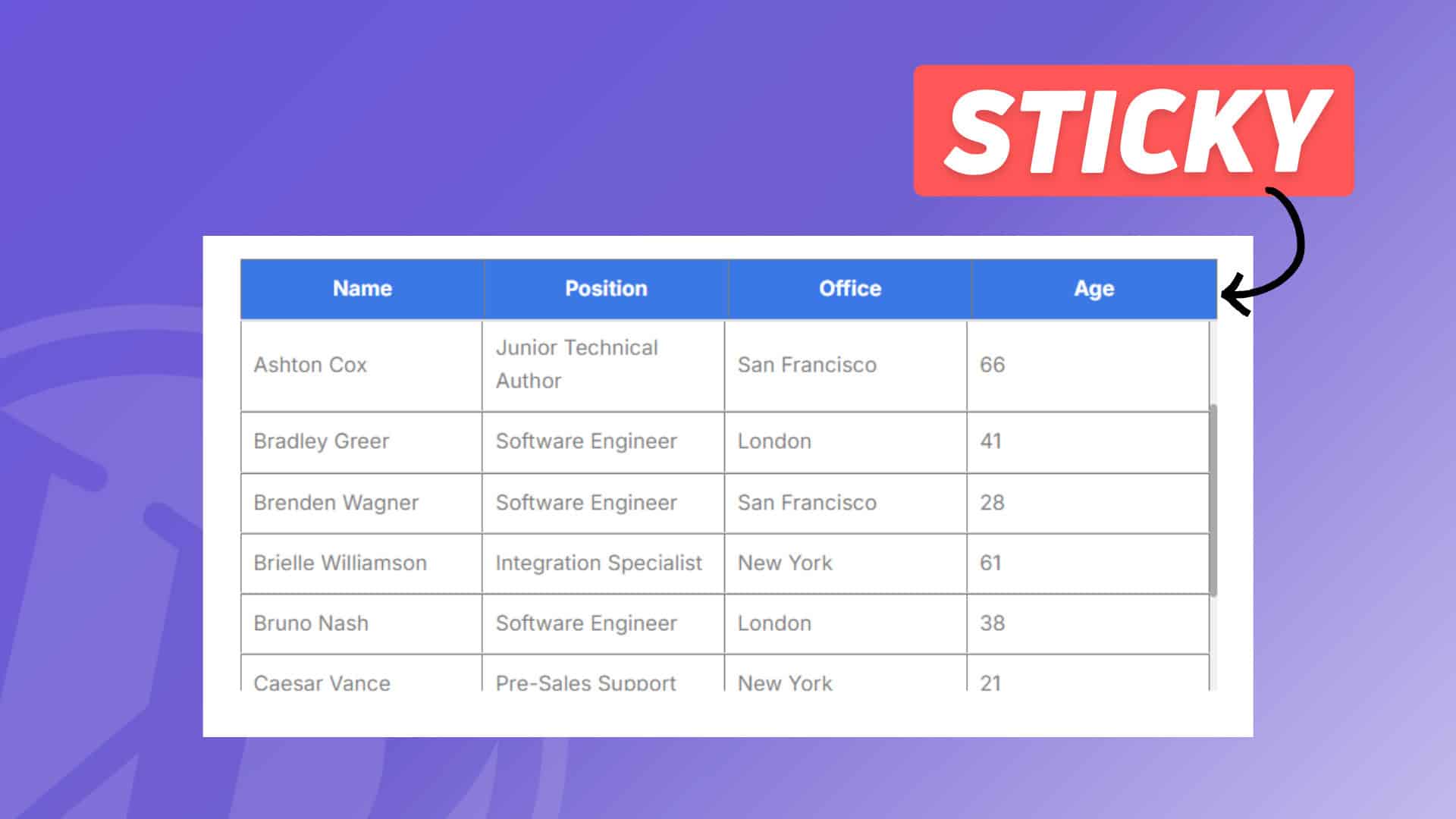
When you want to add a lot of data to a table, it takes a lot of space on the webpage and it will be difficult for the readers to check other elements on the same page. So, instead of showing a long table we are adding a scrollable table with the header section stick to the top.
In this way, table will take limited space and you can add as much row you want without worrying about the table size in the frontend.
This is perfect for showing long database tables on website.
So, Let’s check How to Create a Fixed Headers in WordPress tables.
For this you need to add Few lines of CSS code to your website. You can either use a code manager plugin to load the css for certain post types or on individual pages or load the css globally using the Additional CSS option in theme customizer.
You can follow the video to Learn more about it.
Code for Sticky Headers in Wordpress Table
.scrollable-table-container {
    overflow: hidden;
}

.wp-block-table {
    width: 100%;
    border-collapse: collapse;
}

.wp-block-table tbody {
    display: block;
    max-height: 300px;
    overflow-y: auto;
}

.wp-block-table thead, .wp-block-table tr {
    display: table;
    width: 100%;
    table-layout: fixed;
}

/* Sticky table headers */
.wp-block-table thead th {
    position: sticky;
    top: 0;
    background: #3a78e6;
    Color:white;
    z-index: 10;
    padding: 10px;
    border-bottom: 2px solid #ddd;
}

.wp-block-table thead {
    border-bottom: 0px solid;
}

.wp-block-table tbody tr td {
    padding: 10px;
    border-bottom: 1px solid #ddd;
}

.wp-block-table tbody::-webkit-scrollbar {
    width: 6px;
}

.wp-block-table tbody::-webkit-scrollbar-thumb {
    background-color: #aaa;
    border-radius: 10px;
}

.wp-block-table tbody::-webkit-scrollbar-track {
    background-color: #f1f1f1;
}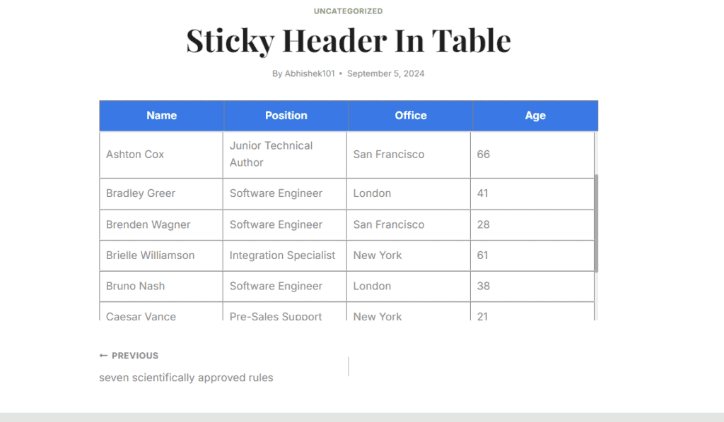
Here, as you can see in the above table, We have added a 300px height but if we keep the normal table then it can take upto 700px of height on the page or higher. (Depending upon the table data)
So, You can set a fixed height here and after that user can scroll through the table and read the whole table data. This table is fully responsive and works best in Desktop, tablet and mobile devices.
You can also follow this Article on How to add a Responsive HTML Table in Blogger & WordPress.
You can also change the header background color and text color by modifying the CSS code as shown in the video.
To add a similar Sticky Header table in Blogger You can use the following code.
<div class="table-container">
    <table class="sticky-header-table">
        <thead>
            <tr>
                <th>Header 1</th>
                <th>Header 2</th>
                <th>Header 3</th>
            </tr>
        </thead>
        <tbody>
            <tr>
                <td>Item 1</td>
                <td>Item 2</td>
                <td>Item 3</td>
            </tr>
<tr>
                <td>Item 1</td>
                <td>Item 2</td>
                <td>Item 3</td>
            </tr>
<tr>
                <td>Item 1</td>
                <td>Item 2</td>
                <td>Item 3</td>
            </tr>
<tr>
                <td>Item 1</td>
                <td>Item 2</td>
                <td>Item 3</td>
            </tr>
<tr>
                <td>Item 1</td>
                <td>Item 2</td>
                <td>Item 3</td>
            </tr>
<tr>
                <td>Item 1</td>
                <td>Item 2</td>
                <td>Item 3</td>
            </tr>
<tr>
                <td>Item 1</td>
                <td>Item 2</td>
                <td>Item 3</td>
            </tr>

            <tr>
                <td>Item 1</td>
                <td>Item 2</td>
                <td>Item 3</td>
            </tr>
<tr>
                <td>Item 1</td>
                <td>Item 2</td>
                <td>Item 3</td>

            </tr>
<tr>
                <td>Item 1</td>
                <td>Item 2</td>
                <td>Item 3</td>

            </tr>

        </tbody>
    </table>
</div>
<style>
.table-container {
    max-height: 300px;
    overflow-y: auto;
    overflow-x: auto; /* Enable horizontal scrolling */
    border: 1px solid #ddd;
    padding: 0;
    margin: 0;
    -webkit-overflow-scrolling: touch;
}


.table-container::-webkit-scrollbar {
    width: 6px;
    height: 6px;
}

.table-container::-webkit-scrollbar-thumb {
    background-color: #aaa;
    border-radius: 10px;
}

.table-container::-webkit-scrollbar-track {
    background-color: #f1f1f1;
}

.sticky-header-table {
    width: 100%;
    border-collapse: collapse;
    table-layout: auto;
    min-width: 600px;
}

.sticky-header-table thead th {
    position: sticky;
    top: 0;
    background: #e64141;
    Color: white;
    z-index: 10;
    border-bottom: 2px solid #000;
    padding: 10px;
    text-align: left;
    box-sizing: border-box;
}

.sticky-header-table tbody tr td {
    padding: 10px;
    box-sizing: border-box;
    word-wrap: break-word;
}

/* Responsive adjustments */
@media (max-width: 600px) {
    .table-container {
        overflow-x: auto;
    }

    .sticky-header-table {
        width: 100%;
        min-width: 600px;
    }

    .sticky-header-table thead th,
    .sticky-header-table tbody tr td {
        padding: 5px;
    }
}

</style>
All you have to do is change the table data and add in the HTML section of the post or page.


Visitors might also like CSS to size the column widths (3 column table example).
Many thanks for your code.
table th:nth-child(1), table td:nth-child(1) {
width: 60%; /* Adjust this width */
}
table th:nth-child(2), table td:nth-child(2) {
width: 10%; /* Adjust this width */
}
table th:nth-child(3), table td:nth-child(3) {
width: 10%; /* Adjust this width */
}
This is excellent. Works perfectly.